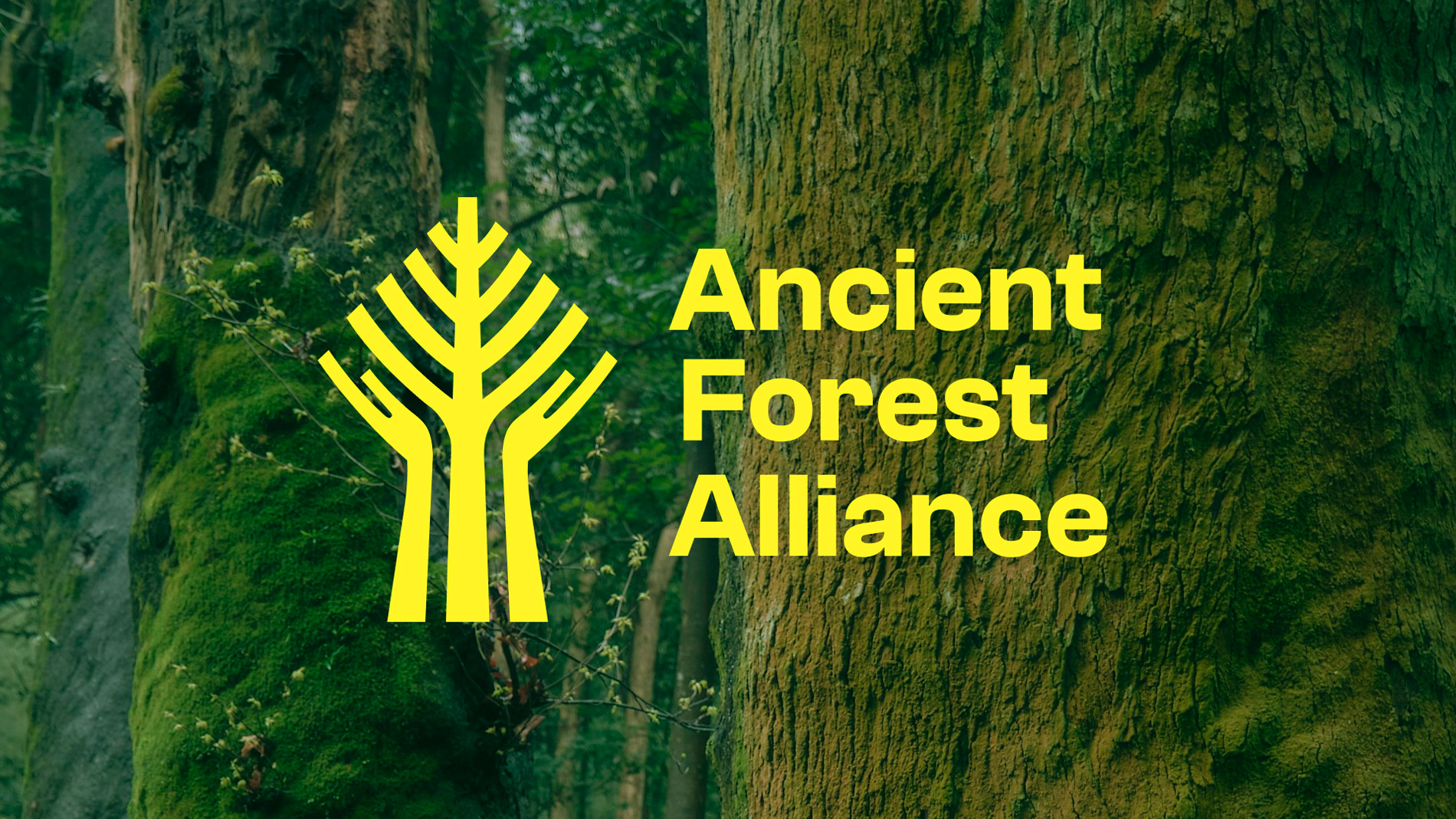
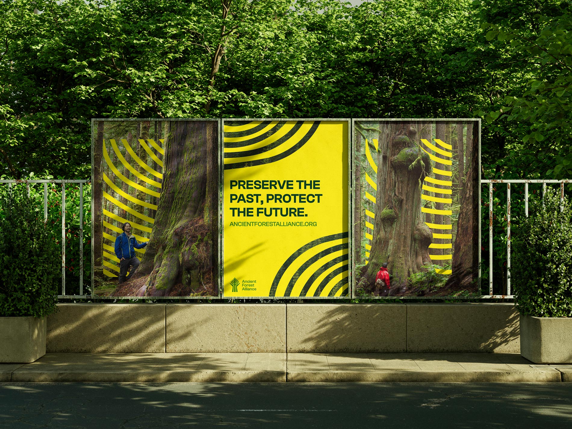
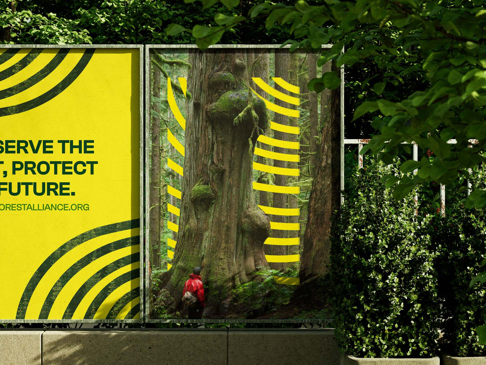
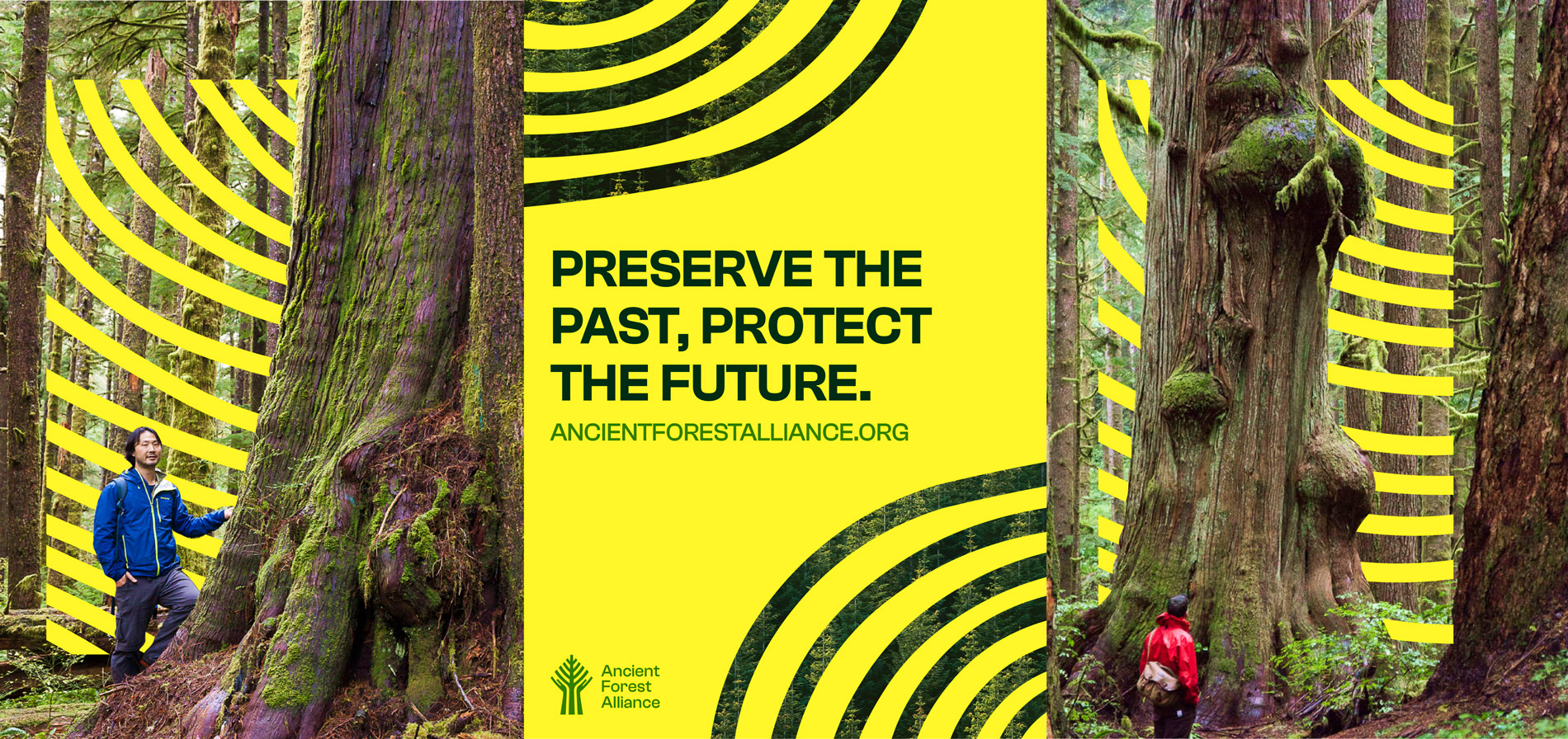
The bold yellow was chosen not only to stand out from the noise, but also to evoke a sense of action and urgency without feeling overwhelming. The brand pattern draws inspiration from the staggering number of tree rings found on old-growth trees.

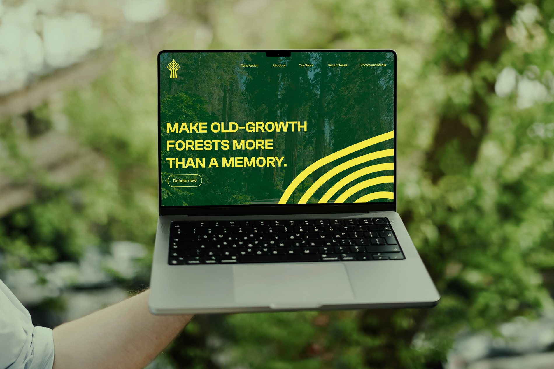
In redesigning the website, I focused on simplifying the user experience and making key calls to action instantly visible. I also ensured the organization’s mission and impact were clearly highlighted throughout the homepage.